CSS Positioning Property: All you need to know!
You won't hate it anymore!

I'm a skilled frontend developer with experience in HTML, CSS, JavaScript, React etc. Passionate about creating visually appealing and user-friendly websites and applications. Always eager to learn new technologies and improve my skills. Check out my GitHub profile for examples of my work and feel free to reach out if you have any questions or projects you'd like to discuss.
⏰ I'd like to take you back in time
I was the guy who used to enjoy using CSS to make websites look nice until the day I accidentally step on the position property of CSS. Back in the day, When I first started using CSS, I used to really dislike the position property.

When it comes to placing things on the website, I often used to struggle. Moreover, there were situations when the top, left, bottom, and right have no impact on the element.
Let's begin by understanding what CSS positioning property is, shall we?
"The CSS position property defines the position of an element in a document. This property works with the left, right, top, bottom and z-index properties to determine the final position of an element on a page."
The position property tells the browser how an element should be positioned on the page. By default the value of position is, static but we can modify it to be any of the following values: relative, absolute, fixed, sticky. In this post, I will discuss each of them.
The position property has five main key values:
Static
Relative
Absolute
Fixed
Sticky
In order to properly position elements on a screen, you need to be aware of two crucial types of properties.
The first one, position:, identifies the kind of positioning technique to be applied to an element (i.e. static, relative, absolute or fixed).
The second is a collection of attributes (top:, bottom:, right:, left:) that are used to specify the offset for the element. In position: static, top, bottom, right, and left are not taken into account because they are calculated differently depending on the positioning technique.
Static
A static-positioned element is always positioned according to the normal flow of the page. The top, right, bottom, left and z-index properties have no effect.
HTML elements are positioned static by default.
The element with position: static; is not positioned in any special way; it is always positioned according to the normal flow of the page.
.item1{
  background-color: #ff695e;
  position: static;
}
/* This is often not needed since HTML elements have a static position by default */
Relative
The element having position: relative; is positioned relative to its normal position. This acts similar to a kind of static positioning except that you can position it relative to itself using top, right, bottom, and left.
Setting the top, right, bottom and left properties of a relatively positioned element will cause it to be adjusted away from its normal position.
Other content will not be adjusted to fit into any gap left by the element.
Let's say this time we modify the previous code from codepen and give the position as relative to .item1. Now you can see we're able to use attributes like the top, right, bottom and left.
.item1{
  background-color: #ff695e;
  position: relative;
  left: 20px;
}
Now it looks like this one below:
If we didn't use properties like left: 20px; then it would look exactly like the one with the position: static.
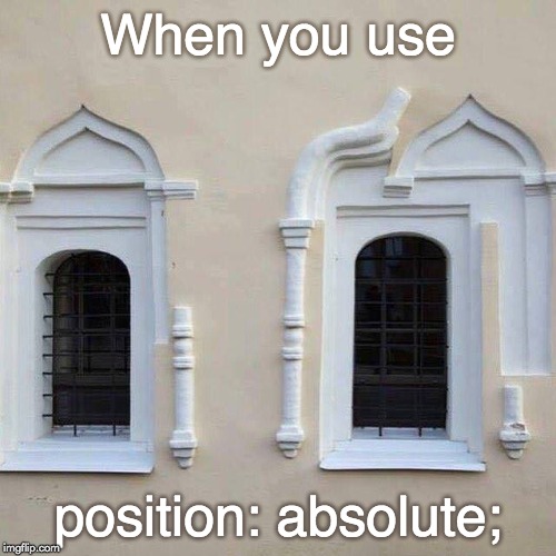
Absolute
This is a very powerful type of positioning that allows you to literally place any page element exactly where you want it.
Absolute-positioned elements are completely taken out of the regular flow of the web page. They are not positioned based on their usual place in the document flow but based on the position of their ancestor.
position: absolute; places an element relative to its parent's position and changes the layout around it.
Note: Its overuse and improper use can limit the flexibility of your website.
You need to use the positioning attributes top, right, bottom and left to set the location. Remember that these values will be relative to the next parent element with the relative (or absolute) positioning. If there is no such parent, it will default all the way back up to the <HTML> element itself, meaning it will be moved relative to the page itself.
To better understand the above statement let's take an example.
/* we're changing position and giving left and right to set the location*/
.item1{
  background-color: #ff695e;
  position: absolute;
  top: 10px;
  right: 0px;
}
Now, after doing this we have two conditions:
- CASE 1: There is a parent element with relative (or absolute) positioning.
/* .box is the next parent (or ancestor) of .item1 */
.box{
  width: 600px;
  height: 300px;
  border: 5px solid grey;
  margin: 50px auto 0 auto;
  border-radius: 25px;
  position: relative;
}
In this case, the element is relative to its parent's position, as shown below:

CASE 2: There is no parent or if a parent is present then it doesn't have any relative (or absolute) positioning. The resulting in
.item1will be placed relative to the page.
You can try implementing this in the codepen above by yourself to understand it better.
Fixed
A fixed position element is positioned relative to the viewport, or the browser window itself. The viewport doesn't change when the window is scrolled, so a fixed-positioned element will stay right where it is when the page is scrolled.
This might be used for something like a navigation bar or chatbot icon.
The only concern with the fixed positioning is that it can cause situations where the fixed element overlaps content which makes them inaccessible.
Sticky
MDN explains it well:
"Sticky positioning is a hybrid of relative and fixed positioning. The element is treated as relative positioned until it crosses a specified threshold, at which point it is treated as fixed positioned."
An element with position: sticky; is positioned based on the user's scroll position.
A sticky element toggles between relative and fixed, depending on the scroll position. It is positioned relative until a given offset position is met in the viewport - then it "sticks" in place (like position: fixed).
In the example below try to scroll inside this frame to understand how sticky positioning works. In this example, the sticky element sticks to the top of the page (top: 0), when you reach its scroll position.
Scroll back up to remove the stickyness.
Note: Internet Explorer does not support sticky positioning. Safari requires a -webkit- prefix (see example below). You must also specify at least one of top, right, bottom or left for sticky positioning to work.
First of all, a big round of applause for you to read the blog this far so carefully. Now as it seems very simple and easy to use, you might be wondering why I used to hate this property and why people find it difficult.
Why it is a "Heck of a deal"?
The CSS position property can become hectic for a few reasons.
Firstly, the position property can be quite complex and difficult to understand, especially for new web developers. It's important to have a good understanding of the different position values and how they affect the positioning of elements on a page. This can take some time and practice to master.
Secondly, the position property can interact with other CSS properties in unexpected ways, which can lead to difficult-to-debug issues. For example, if you have a relatively positioned element inside an absolutely positioned element, the relatively positioned element will be positioned relative to its parent instead of the document body. This can be confusing and cause unexpected layout issues.
Finally, overuse of the position property can make your code difficult to maintain and scale. If you're using position to achieve complex layouts, it's important to make sure your code is well-organized and documented so that it's easy to understand and modify in the future.
Despite these challenges, the CSS position property is a powerful tool that is essential for creating custom layouts and user interfaces. By understanding the different position values and how they interact with other CSS properties, you can create beautiful and functional web pages that are a joy to use.
Practical Applications
Now that we've covered all five values of the position property, let's talk about some practical applications.
The position property is especially useful when creating custom layouts, such as a fixed navigation bar that stays in place while the user scrolls. It is also useful for creating elements that overlap other elements, such as pop-up boxes or tooltips.
However, it's important to use position property with caution. If overused, it can make your code difficult to maintain and cause unexpected results. Always try to use a combination of position values with other CSS properties, such as display, float, and margin, to achieve the desired layout.
In conclusion, the position property is an essential tool for web developers, but it should be used with care. By mastering the different values of the position property, you can create custom layouts and user interfaces that are both functional and visually appealing. I hope this blog has been helpful in understanding the CSS position property.
And this is everything you'll ever need to position elements on a webpage like a pro.
Wanna know more about me?
Across a variety of platforms, I share tech-related stuff pertaining to web development. Occasionally, you may find a funny joke and mostly some useful information. Please feel free to look them up.
If you want me to write for you or for your company, you can contact me also.
🔗 Links:
🌎 GitHub: Prabhat1001
ℹ️ LinkedIn: Prabhat Kumar Saraswat
📧 Email: prabhatsaraswat24@gmail.com
🐦 Twitter: @PrabhatSar10
consider following me on other platforms too ☝️


