CSS Flexbox: Your Secret Weapon for Stunning Websites

I'm a skilled frontend developer with experience in HTML, CSS, JavaScript, React etc. Passionate about creating visually appealing and user-friendly websites and applications. Always eager to learn new technologies and improve my skills. Check out my GitHub profile for examples of my work and feel free to reach out if you have any questions or projects you'd like to discuss.
Hello there! Have you ever heard of Flexbox before?

If not, don't worry at all! I'm here to help you learn all about it in a fun and easy way. By the end of this blog, you'll be a pro at using Flexbox for your web designs. So sit back, relax, and let's explore together!
CSS Flexbox is a powerful tool that has been around for a while, but it's still a mystery to many web developers. Flexbox is a CSS layout module that makes it easy to design flexible and responsive layouts for web pages. In this blog post, we will cover everything you need to know about Flexbox and how to use it to create stunning web layouts.
What is Flexbox? 📦
Flexbox is a CSS layout module that allows you to create flexible and responsive layouts. It's designed to simplify the process of designing web layouts by providing a flexible, easy-to-use layout system. Flexbox allows you to align and distribute items in a container, making it an excellent choice for creating responsive layouts.

What are the Benefits of Using CSS Flexbox?
Flexbox offers many benefits, making it an ideal choice for designing web layouts. Here are some of the main benefits of using CSS Flexbox:
Flexibility: Flexbox allows you to create flexible layouts that adjust to different screen sizes and devices.
Easy to Use: Flexbox is easy to use and requires less code than traditional CSS layouts.
Responsive: Flexbox is responsive, allowing you to create layouts that adapt to different screen sizes and devices.
Alignment: Flexbox provides easy alignment options for your layout items, making it easier to create clean, professional layouts.
Directional: Flexbox allows you to change the direction of your layout items, making it easy to create horizontal or vertical layouts.
How Does CSS Flexbox Work?
Flexbox works by using containers and items. The container is the parent element that contains the items, which are the child elements. The container can be set to display:flex;, which enables the Flexbox layout system. Once the container is set to display:flex;, you can use the Flexbox properties to align and distribute the items within the container.
Here are some of the most commonly used Flexbox properties:
justify-content: This property aligns items horizontally within the container.
align-items: This property aligns items vertically within the container.
flex-direction: This property defines the direction of the Flexbox layout, either horizontal (row) or vertical (column).
flex-wrap: This property allows items to wrap to a new line if there isn't enough space within the container etc.
NOTE: There are other properties too, we'll discuss all of them in detail.
"Hey, I believe it's the perfect time to dive into understanding these properties with the help of interactive examples! Let's make learning fun and engaging by exploring practical examples that you can follow along with."
Note: You can copy and paste the above code into your CodePen or any other platform, and interact with it alongside this blog. This will help you to better understand it.
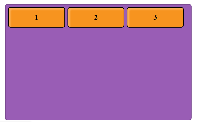
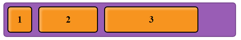
As you can see in the above example, elements are aligned vertically which is the default flow of the document.
If you open the code of the above example, you'll find that we give classes to these elements.
Class .container for the purple box which contains three orange boxes and these three boxes have classes too, which are .item-1, .item-2, and .item-3 respectively.
Main axis and Cross axis
In Flexbox, there are two main axes: the main axis and the cross axis. The main axis is the axis along which the flex items are laid out, and it is determined by the value of the flex-direction property. The cross-axis is perpendicular to the main axis.

For example, if the flex-direction is set to row, the main axis is horizontal, and the cross axis is vertical. Conversely, if the flex-direction is set to column, the main axis is vertical, and the cross axis is horizontal.
The main axis is important because it determines how flex items are aligned and distributed within the container using properties like justify-content and align-items. The cross axis is also important because it determines how the items are aligned and distributed perpendicular to the main axis using properties like align-content and align-self.
Understanding the main axis and cross axis is key to creating effective and responsive layouts with Flexbox.
Parent properties 👨🏻

Note: Here our container is the parent element and the properties that we're going to use will apply to the box with class .container
display
To enable Flexbox, you must set the display property of the container to either "flex" or "inline-flex". This property serves the purpose of defining the container as a flex container.
.container{
    display: flex;
}
After adding the 'display' property as 'flex' to the CSS code we used earlier, the output should look like this:
flex-direction
The "flex-direction" property determines the orientation of the main axis in a flex container. By default, it is set to "row", but it can also be set to "row-reverse", "column", or "column-reverse".
.container{
    display: flex;
    flex-direction: row | row-reverse | column | column-reverse;
}
flex-direction: row; Since 'row' is the default value for the 'flex-direction' property, there will be no change in the direction of the elements.
flex-direction: row-reverse; The 'row-reverse' value for the 'flex-direction' property displays the elements in the same order as 'row', but in reverse.

flex-direction: column; When the 'flex-direction' property is set to 'column', the items in the container will appear the same as they did initially.

flex-direction: column-reverse; The 'column-reverse' value for the 'flex-direction' property displays the elements in the same order as 'column', but in reverse.

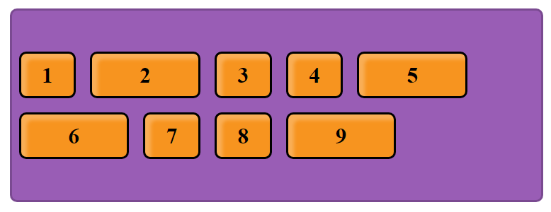
flex-wrap
The 'flex-wrap' property allows you to control whether flex items should wrap or all fit onto one line by default.
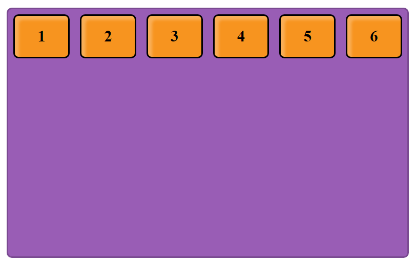
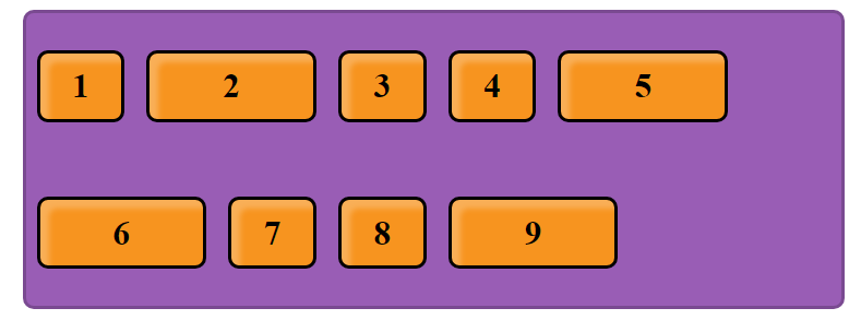
To understand it better let's add more elements.
flex-wrap: no-wrap; The 'now-rap' value is the default setting for the 'flex-wrap' property. When set to 'now-rap', all flex items will be displayed on a single line, without wrapping to the next line.
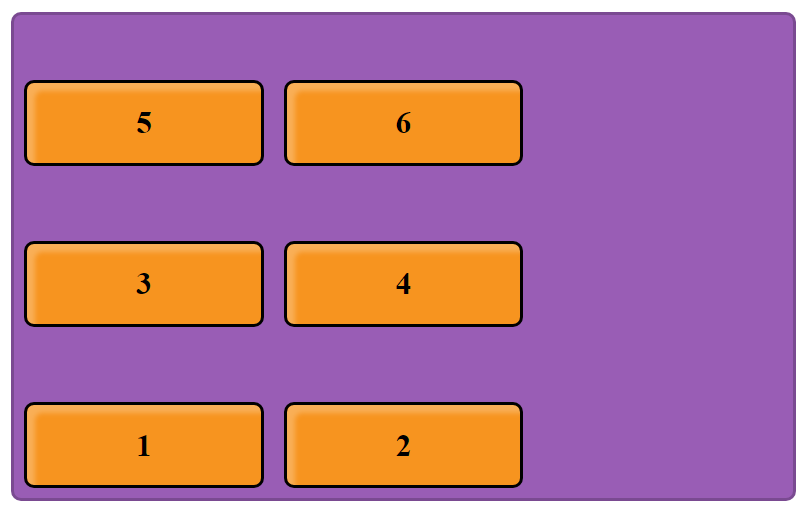
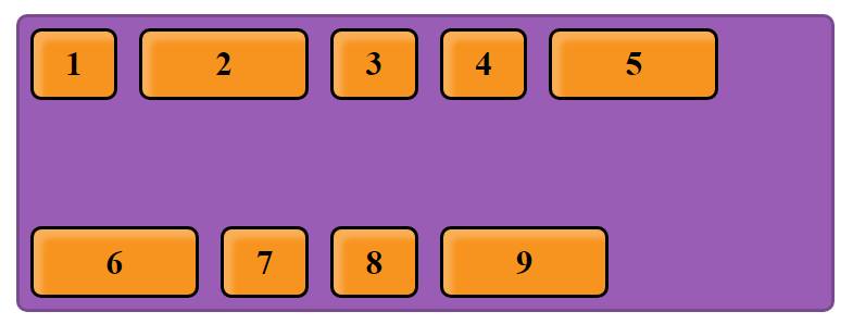
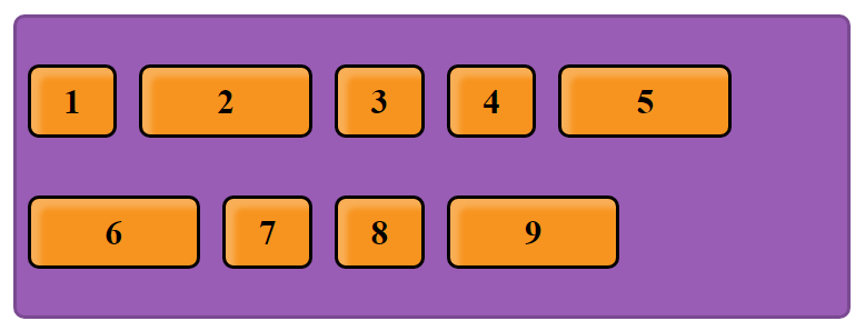
flex-wrap: wrap; When the 'flex-wrap' property is set to 'wrap', flex items will be positioned on multiple lines, top to bottom, wrapping as necessary.

flex-wrap: wrap-reverse; When the 'flex-wrap' property is set to 'wrap-reverse', flex items will be positioned on multiple lines, bottom to top, wrapping as necessary.
justify-content
The 'justify-content' property controls the alignment of flex items along the main axis. It serves two primary purposes:
Firstly, it helps distribute extra free space that is left over when all the flex items on a line are inflexible or have reached their maximum size.
Secondly, it also provides some control over the alignment of items when they overflow the line.
.container {
  justify-content: flex-start | flex-end | center | space-between | space-around | space-evenly;
}
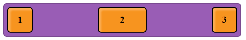
justify-content: flex-start; Default value. Items are positioned at the beginning of the container.

justify-content: flex-end; Items are positioned at the end of the container

justify-content: center; Items are positioned in the centre of the container.

justify-content: space-between; items are evenly distributed in the line; the first item is on the start line, and the last item is on the end line.
justify-content: space-around; items are evenly distributed in the line with equal space around them.
Note: visually the spaces aren’t equal, since all the items have equal space on both sides. The first item will have one unit of space against the container edge, but two units of space between the next item because that next item has its own spacing that applies.

justify-content: space-evenly; items are distributed so that the spacing between any two items (and the space to the edges) is equal.

align-items
The 'align-items' property defines the default layout of flex items along the cross-axis on the current line. It's similar to 'justify-content', but instead of controlling the main axis, it controls the cross axis (which is perpendicular to the main axis).
In other words, 'align-items' determines how flex items are aligned vertically when they don't take up all the available space on the cross-axis.
.container {
  align-items: stretch | flex-start | flex-end | center | baseline;
}
align-items: flex-start; When the 'align-items' property is set to 'flex-start', flex items are placed at the start of the cross-axis. The difference between 'flex-start' and 'start' is subtle, and it relates to whether the layout respects the 'flex-direction' rules or the 'writing-mode' rules.

align-items: flex-end; When the 'align-items' property is set to 'flex-end', flex items are placed at the end of the cross-axis. The difference between 'flex-end' and 'end' is subtle, and it relates to whether the layout respects the 'flex-direction' rules or the 'writing-mode' rules.
align-items: center; items are centered on the cross-axis.

align-items: stretch; stretch (default): stretch to fill the container (still respect min-width/max-width).

align-items: baseline; items are aligned such as their baselines align.
align-content
The 'align-content' property aligns a flex container's lines within the container when there is extra space in the cross-axis.
It's similar to 'justify-content', which aligns individual items within the main axis. However, instead of aligning individual items, 'align-content' aligns entire lines of items within the container.
.container {
    flex-wrap: wrap; /* important to use along with align-content */
    align-content: flex-start | flex-end | center | space-between | space-around | space-evenly | stretch;
}
Note: the 'align-content' property only takes effect on multi-line flexible containers where 'flex-wrap' is set to either 'wrap' or 'wrap-reverse'. It's important to note that a single-line flexible container (i.e. where 'flex-wrap' is set to its default value of 'no-wrap') will not reflect 'align-content'.
align-content: flex-start; When the 'justify-content' or 'align-items' property is set to 'start', flex items are packed to the start of the container.
There are two values for 'start': 'flex-start' and 'start'. The more commonly supported value is 'flex-start', which honours the 'flex-direction'. On the other hand, 'start' honours the writing-mode direction.

align-content: flex-end; When the 'justify-content' or 'align-items' property is set to 'end', flex items are packed to the end of the container.
There are two values for 'end': 'flex-end' and 'end'. The more commonly supported value is 'flex-end', which honours the 'flex-direction'. On the other hand, 'end' honours the writing-mode direction.

align-content: center; items centered in the container.
align-content: space-between; items evenly distributed; the first line is at the start of the container while the last one is at the end.
align-content: space-around; items evenly distributed with equal space around each line.
align-content: space-evenly; items are evenly distributed with equal space around them.
align-content: stretch; lines stretch to take up the remaining space.

Child Properties 👶🏻🍼

We give classes like .item-1, .item-2, .item-3 etc to child elements inside the container.
order
By default, flex items are laid out in the source order, which means they appear in the container in the same order as they appear in the HTML source code.
However, the 'order' property allows you to control the order in which flex items appear in the container. The 'order' property takes a numerical value, and flex items are arranged in ascending order based on their 'order' value. Flex items with the same 'order' value are arranged in their original source order.
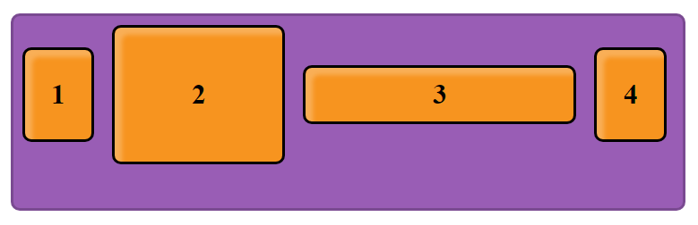
Original Source Order (by default):
.item-1{
  width: 10%;
}
.item-2{
  width: 25%;
}
.item-3{
  width: 40%;
}
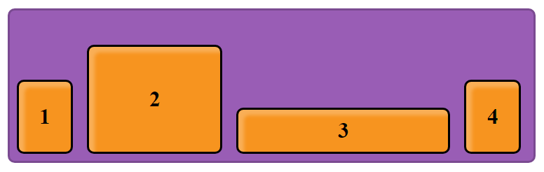
Suppose, we want to change the order according to our needs then, We'll use order property.
After applying order property on child elements:
.item-1{
  width: 10%;
  order: 2;
}

.item-2{
  width: 25%;
  order: 3;
}

.item-3{
  width: 40%;
  order: 1;
}

align-self
In Flexbox, the align-self property is used to align individual flex items along the cross-axis, overriding the default alignment set by the container's align-items property.
The align-self property accepts the same values as the align-items property, including stretch, flex-start, flex-end, center, and baseline.
For example, consider a Flexbox container with align-items: center;, which centers all the flex items along the cross-axis. However, if you want a specific flex item to be aligned differently, you can use the align-self property on that item to override the container's alignment for that particular item.
.item {
  align-self: auto | flex-start | flex-end | center | baseline | stretch;
}
See the example below where we use different values of align-self on different items.

/*code for the above example:*/

.item-1{
  width: 20%;
  align-self: flex-start;
}

.item-2{
  width: 10%;
  align-self: center;
}

.item-3{
  width: 40%;
  align-self: flex-end;
}

.item-4{
  width: 20%;
}
So that's pretty much all you need to know about Flexbox in order to use it effectively. By using the properties and values I've covered in this blog, you can easily create flexible and responsive layouts for your web pages.
I hope you've found this guide helpful and that you now have a good understanding of each and every concept covered. Remember to practice and experiment with different flexbox configurations to get a feel for how they work in practice.
With Flexbox, you can take control of the layout of your web pages and create modern, dynamic designs that look great on any device. So go forth and use this powerful tool to its fullest.

Wanna know more about me?
Across a variety of platforms, I share tech-related stuff pertaining to web development. Occasionally, you may find a funny joke and mostly some useful information. Please feel free to look them up.
If you want me to write for you or for your company, you can contact me also.
🔗 Links:
🌎 GitHub: Prabhat1001
ℹ️ LinkedIn: Prabhat Kumar Saraswat
📧 Email: prabhatsaraswat24@gmail.com
🐦 Twitter: @PrabhatSar10
consider following me on other platforms too ☝️


